Confused by data visualiza-tion? Here’s how to cope
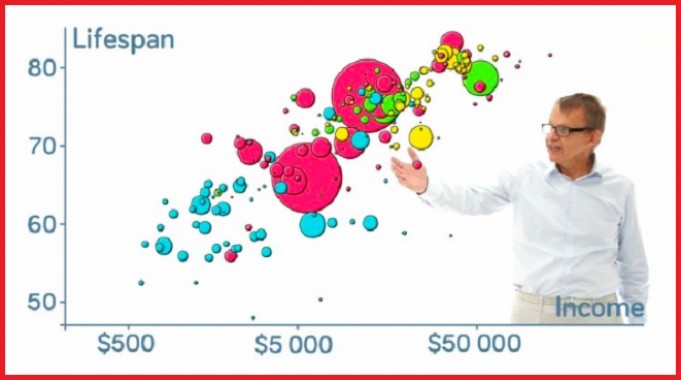
Hans Rosling paved the way for effectively communicating global health data. Vimeo
Reprinted from The Conversation
The late data visionary Hans Rosling mesmerised the world with his work, contributing to a more informed society. Rosling used global health data to paint a stunning picture of how our world is a better place now than it was in the past, bringing hope through data.
Now more than ever, data are collected from every aspect of our lives. From social media and advertising to artificial intelligence and automated systems, understanding and parsing information have become highly valuable skills. But we often overlook the importance of knowing how to communicate data to peers and to the public in an effective, meaningful way.
The first tools that come to mind in considering how to best communicate data – especially statistics – are graphs and scatter plots. These simple visuals help us understand elementary causes and consequences, trends and so on. They are invaluable and have an important role in disseminating knowledge.
Data visualisation can take many other forms, just as data itself can be interpreted in many different ways. It can be used to highlight important achievements, as Bill and Melinda Gates have shown with their annual letters in which their main results and aspirations are creatively displayed.
Everyone has the potential to better explore data sets and provide more thorough, yet simple, representations of facts. But how can do we do this when faced with daunting levels of complex data?
A world of too many features
We can start by breaking the data down. Any data set consists of two main elements: samples and features. The former correspond to individual elements in a group; the latter are the characteristics they share.
Anyone interested in presenting information about a given data set should focus on analysing the relationship between features in that set. This is the key to understanding which factors are most affecting sales, for example, or which elements are responsible for an advertising campaign’s success.
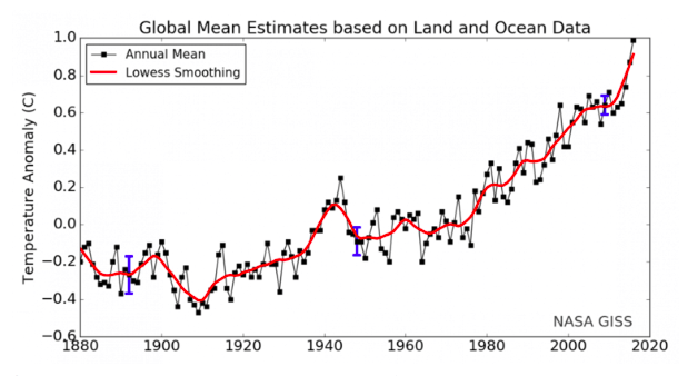
When only a few features are present, data visualisation is straightforward. For instance, the relationship between two features is best understood using a simple scatter plot or bar graph. While not that exciting, these formats can give all the information that system has to offer.

Global temperature rise over the years: the relationship between both features is easy to see and conclusions can be quickly drawn. NASA
Data visualisation really comes into play when we seek to analyse a large number of features simultaneously. Imagine you are at a live concert. Consciously or unconsciously, you’re simultaneously taking into account different aspects of it (stagecraft and sound quality, for instance, or melody and lyrics), to decide whether the show is good or not.
This approach, which we use to categorise elements in different groups, is called a classification strategy. And while humans can unconsciously handle many different classification tasks, we might not really be conscious of the features being considered or realise which ones are the most important.
Now let’s say you try to rank dozens of concerts from best to worst. That’s more complex. In fact, your task is twofold, as you must first classify a show as good or bad and then put similar concerts together.
Finding the most relevant features
Data visualisation tools enable us to bunch different samples (in this case, concerts) into similar groups and present the differences between them.
Clearly, some features are more important in deciding whether a show is good or not. You might feel an inept singer is more likely to affect concert quality than, say, poor lighting. Figuring out which features impact a given outcome is a good starting point for visualising data.
Imagine that we could transpose live shows onto a huge landscape, one that is generated by the features we were previously considering (sound for instance, or lyrics). In this new terrain, great gigs are played on mountains and poor ones in valleys. We can initially translate this landscape into a two-dimensional map representing a general split between good and bad.
We can then go even further and reshape that map to specify which regions are rocking in “Awesome Guitar Solo Mountain” or belong in “Cringe Valley”.

When in a data landscape, look for peaks and valleys.
Dimensionality reduction, where a given data set with too many features (dimensions) can be reduced into a map where only relevant, meaningful information is represented. While a programming background is advantageous, several accessible resources, tutorials and straightforward approaches can help you capitalise on this great tool in a short period of time.
Network analysis and the pursuit of similarity
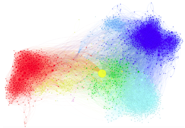
Finding similarity between samples is another good starting point. Network analysis is a well-known technique that relies on establishing connections between samples (also called nodes). Strong connections between samples indicate a high level of similarity between features.
Once these connections are established, the network rearranges itself so that samples with like characteristics stick together. While before we were considering only the most relevant features of each live show and using that as reference, now all features are assessed simultaneously – similarity is more broadly defined.

Networks show a highly connected yet well-defined world.
The amount of information that can be visualised with networks is akin to dimensionality reduction, but the feature assessment aspect is now different. Whereas previously samples would be grouped based on a few specific marking features, in this tool samples that share many features stick together. That leaves it up to users to choose their approach based on their goals.
Venturing into network analysis is easier than undertaking dimensionality reduction, since usually a high level of programming skills is not required. Widely available user-friendly software and tutorials allow people new to data visualisation to explore several aspects of network science.
The world of data visualisation is vast and it goes way beyond what has been introduced here, but those who actually reap its benefits, garnering new insights and becoming agents of positive and efficient change, are few. In an age of overwhelming information, knowing how to communicate data can make a difference – and it can help keep data’s relevance in check.
Matt Escobar is a postdoctoral researcher on machine learning applied to chemical engineering, University of Tokyo.
Matt Escobar receives funding from the Core Research for Evolutionary Science and Technology (CREST) project 'Development of a knowledge-generating platform driven by big data in drug discovery through production processes' of the Japan Science and Technology Agency (JST)


